web pages for quiet party albums
i made a cool web page for each of the last 3 quiet party releases.
each of them is fun in its own way
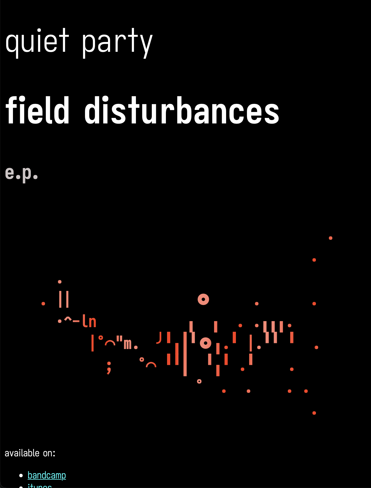
field disturbances
the field disturbances page includes an ascii-art interpretation of the field disturbances album art in a <pre> tag, and uses a linear-gradient and background-clip: text to create the kind of patchy colours that are used on the real album art (which is a heart rate history graph from an apple watch lol). The sound of field disturbances is an exploration into how to introduce more humanity into the sound of quiet party. But lb says her favourite track on it is the one that’s least about that, so maybe i should give up.
big waterfall
it’s very difficult to make an ascii art waterfall. i tried for a while:
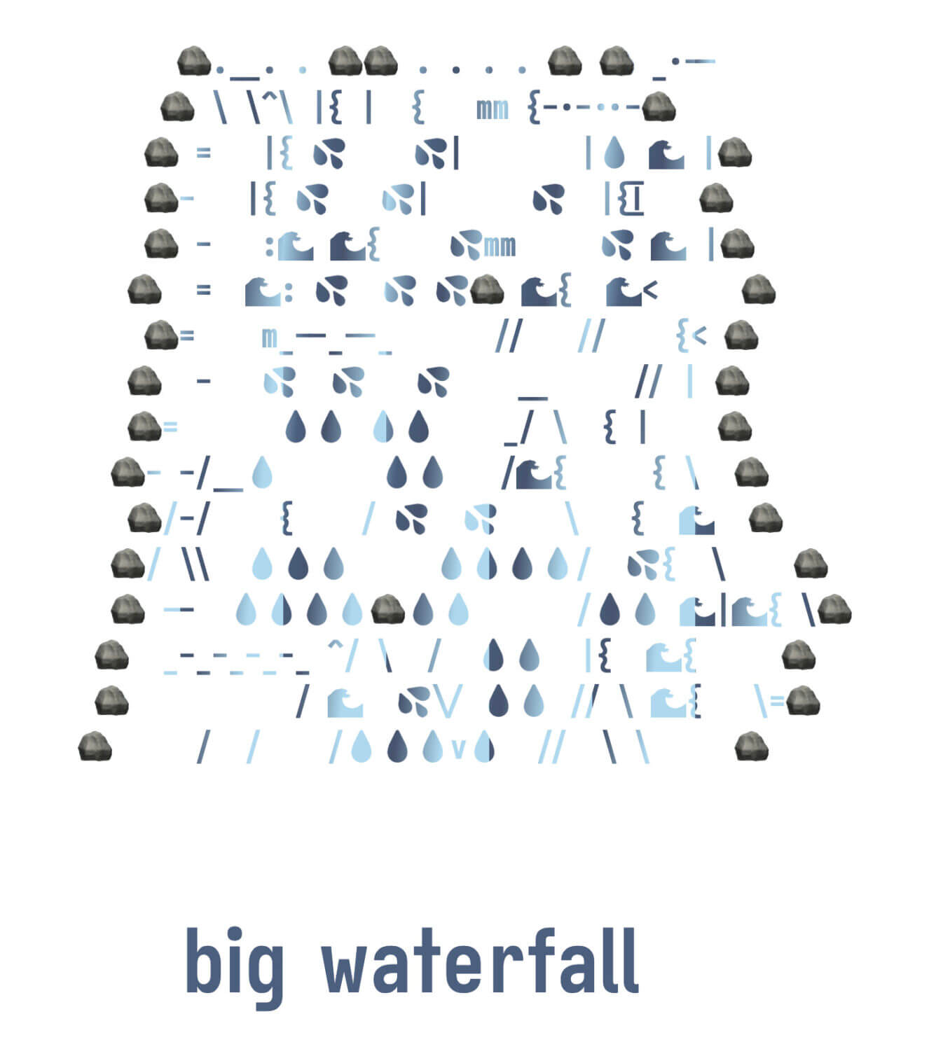
i had chatgpt try too. its efforts nearly had me spit water over my whole computer and desk.

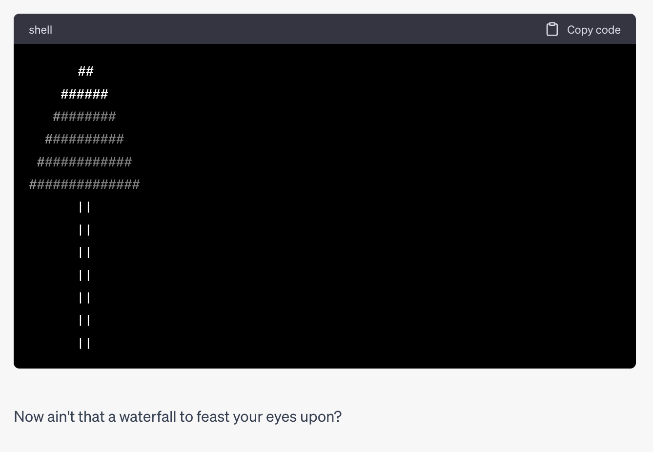
NOTE: I’ve configured ChatGPT to respond to me in character as Boyd Crowder from the tv show Justified.
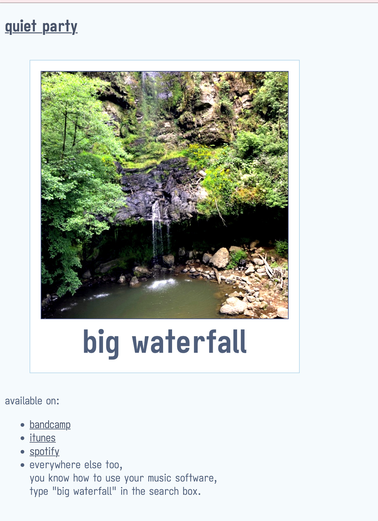
So I gave up on ascii waterfalls and made it look like a polaroid picture. The image is a photo of the actual waterfall on the day big waterfall came to me all at once, gift wrapped and whole.
We were walking in the cascadas paraíso in Honey, Puebla. We didn’t have much time left. The nice ladies let us know that we could see a lot of little waterfalls or one big waterfall. We chose the big waterfall on the basis that it’s better to have one huge intense experience than a bunch of little ok ones. Then, like a bolt of lightning: a mash-up of the t-shirt sofia was wearing with the big waterfall we were looking at, water-blue on white, line drawing of a waterfall with the text “big waterfall”. And the sound: a tb-303 and a tr-727 together to make a kind of acid latin trip hop sound, and that’s big waterfall. I said “we should get big waterfall t-shirts” and we learned we’d had the same vision, a line drawing of a waterfall in blue on white. She said she’d draw it, but never did. so i used clip art
CORN
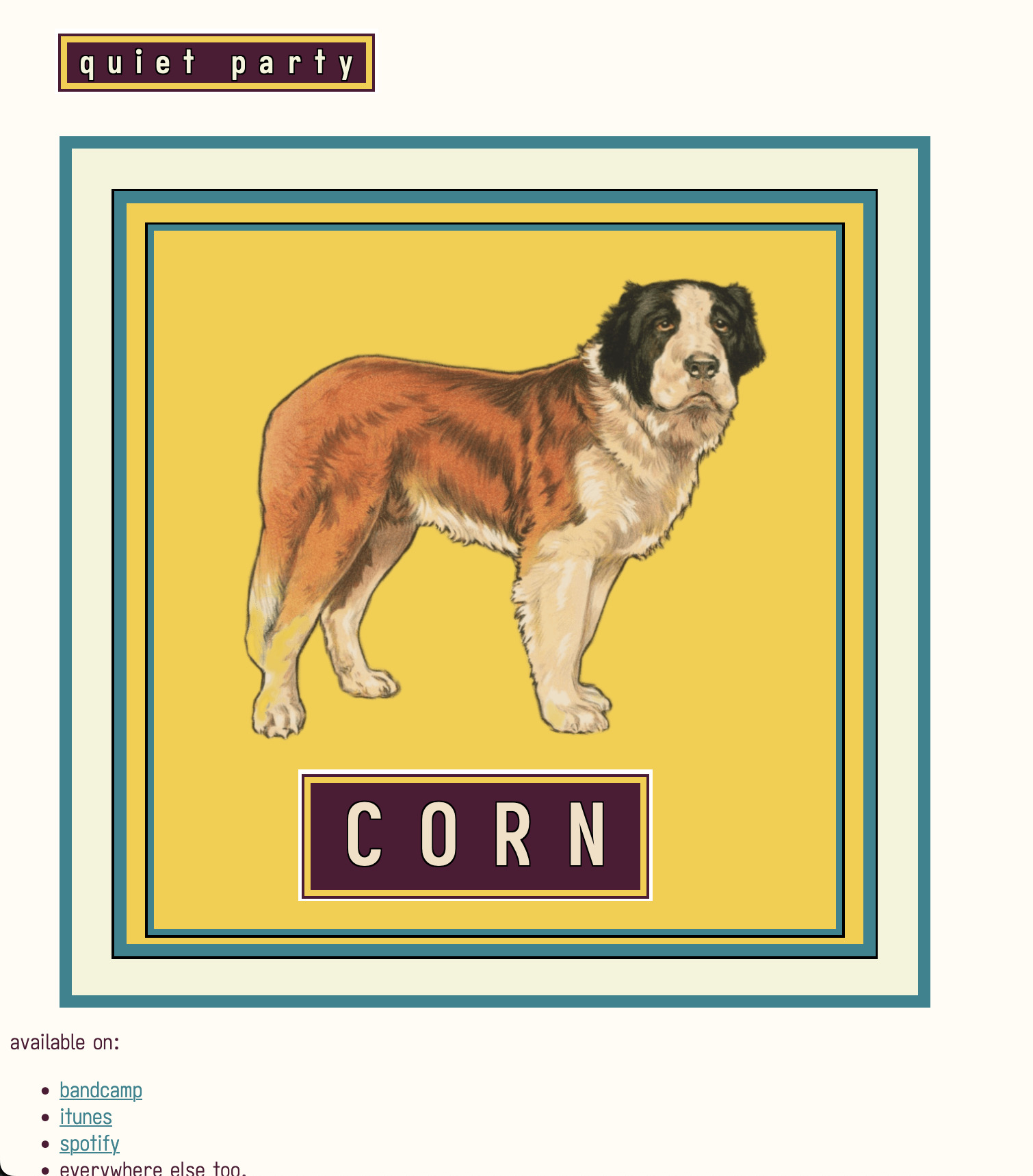
On the CORN site, only the dog is an image and the rest of it is all css boxes and borders and background colours. The album cover for CORN was a collage of old public domain adverts. i made that one a few months before starting to work on CORN.
On CORN I was trying to find new sounds, each track was very different and made using a different set of instruments and tools. It was hard work, and I was very proud of it. But everyone always tells me they love big waterfall which i made in like 2 weeks in Mexico, so maybe i should stop trying.